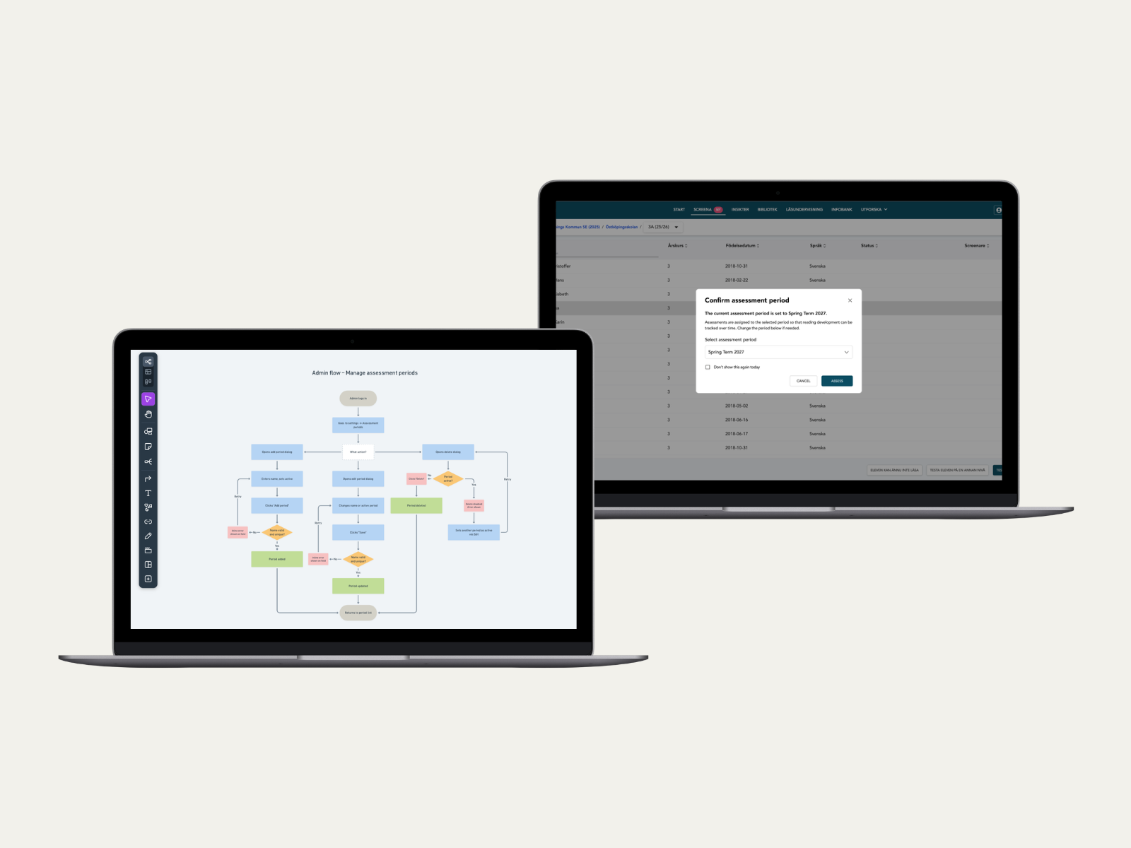
Making reading progress comparable at scale: Assessment periods
A UX/UI project covering flow mapping and interaction design for introducing a new feature to compare reading results over time in the Lexplore portal.
Overview
All results from Lexplore's reading assessments are gathered in one place in the Lexplore portal. This gives schools and organisations a clear picture of each student's reading development over time. For that picture to be useful, results need to be comparable, not just collected.
This project introduced assessment periods: labels that organisations can create to sort assessments into defined windows of time, such as spring term or autumn assessment. Without them, comparing results across time required significant manual work.
Role
UX/UI Designer
Team
1 UX/UI Designer, 2 developers, 1 CS Manager, product owner
Project duration
2 weeks
The problem
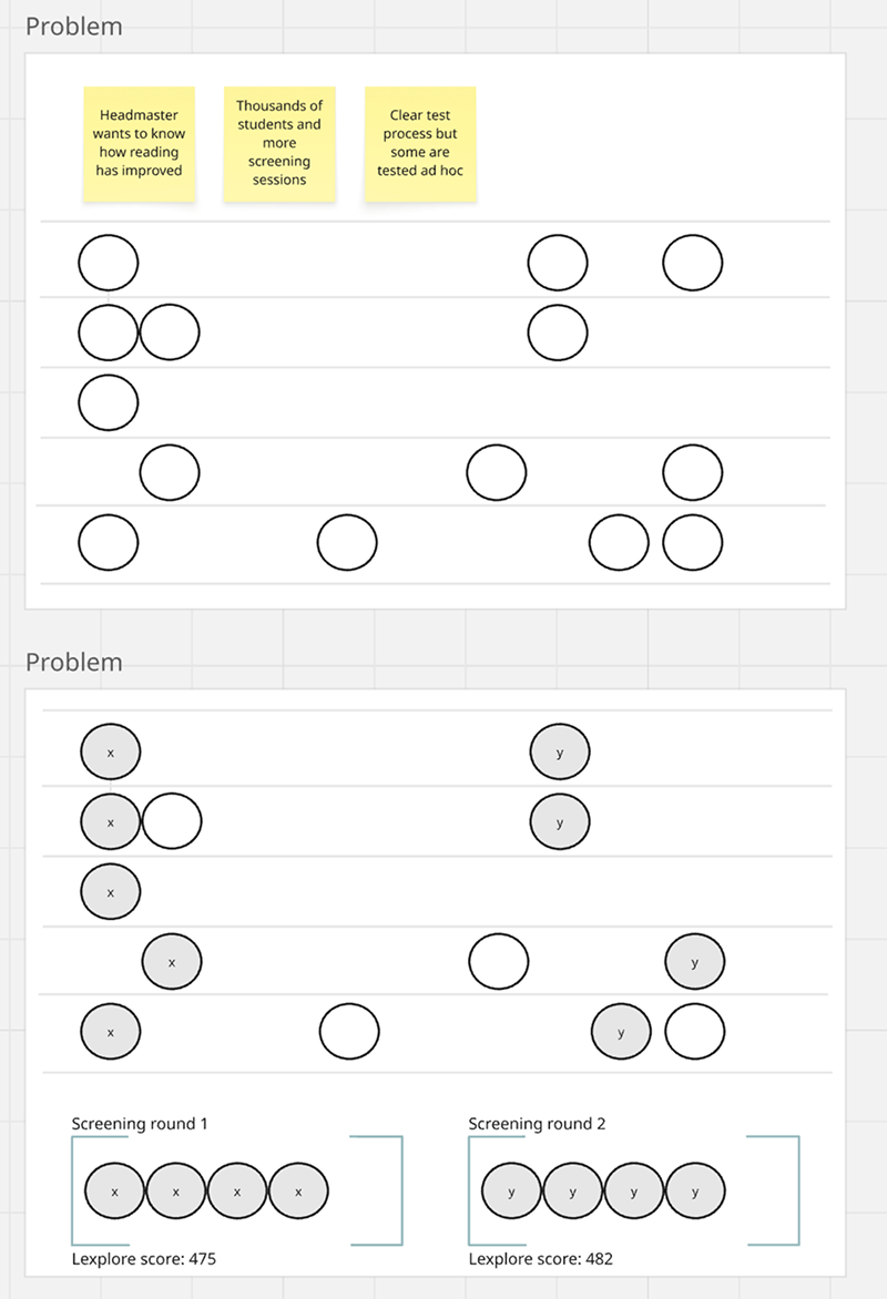
For large organisations with thousands of students, understanding whether reading had improved required comparing results across assessment periods. The portal didn't support this. Students were assessed on a regular schedule, some also ad hoc during the year, and when organisations exported data for analysis, separating these periods required significant manual work.
This wasn't a new problem. Several organisations had requested it directly through customer success and support tickets. Lexplore needed a way to tag assessments to a period at the point of assessment, so that data could be sorted and compared meaningfully in exports.
The process
Scoping the project
The project started with a kickoff meeting with head of product, frontend developer, backend developer, and customer success. Together we defined the scope, what needed to be built, who it would affect, and where in the product it would live.
Mapping the flows
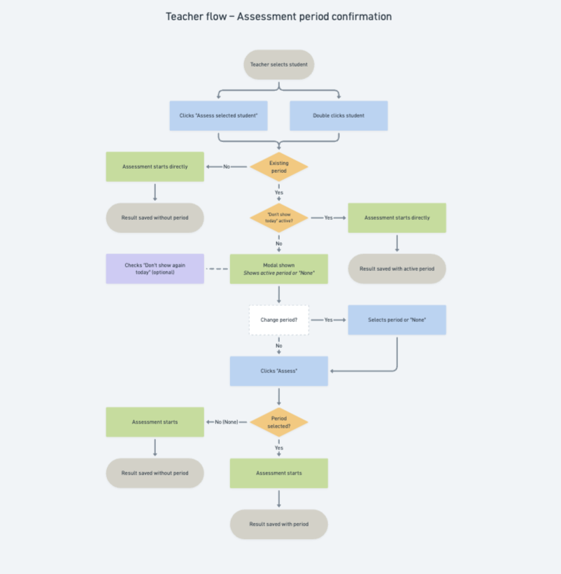
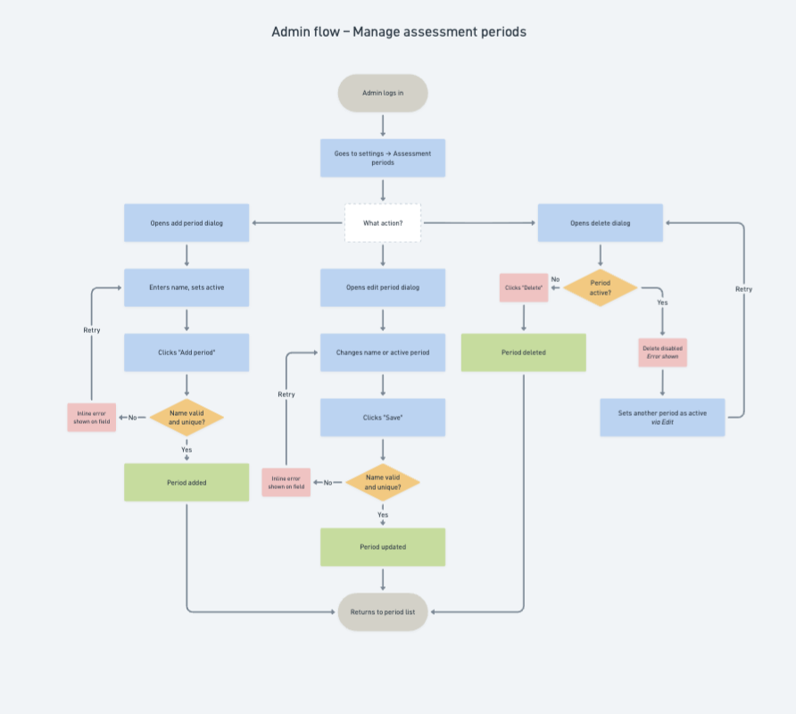
Before designing any frames, I created three flow charts to map the interactions that needed to be designed: one teacher flow and two admin flows. The core challenge was deciding where and how a teacher would assign an assessment period.
My first instinct was to integrate the choice into the assessment flow itself, but the head of product flagged a technical constraint: Web Assessment runs as a separate application, which meant the period tag had to be assigned before opening it.
The alternative was showing the period selection in the student list, before the teacher clicked to assess. But that would have added an extra step for teachers, requiring them to remember to set or change the period before beginning, and risked the selection being overlooked entirely.
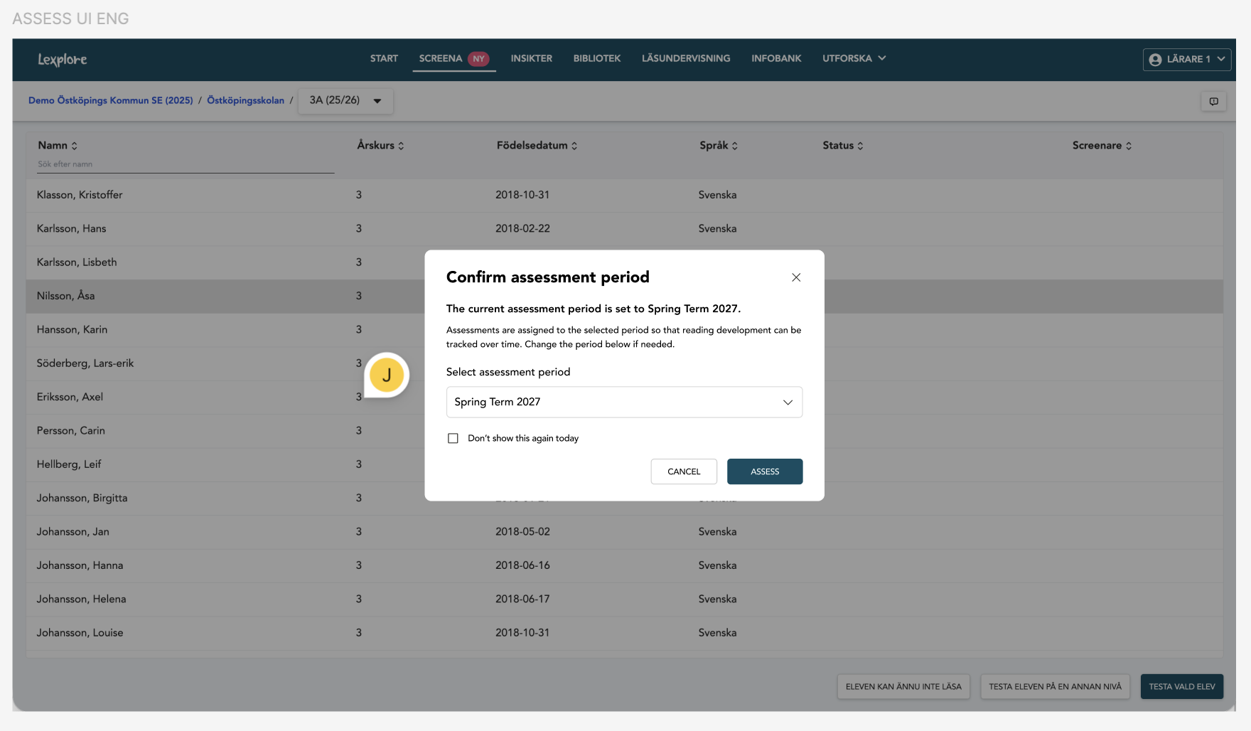
This pushed me toward a confirmation dialogue, triggered at the moment the teacher clicks to assess a student. The flow charts gave the team a shared picture of the full scope before any design decisions were made.
Designing the confirmation dialogue
I designed an initial version of the confirmation dialogue and presented it to the team to align on direction. The discussion that followed shaped two decisions that made the dialogue work.
First, we decided to have the active assessment period preselected by default, which changed the interaction from "select a period" to "confirm a period." That shift in framing, reflected in the copy, signalled to the teacher that this was a low-effort step, not an additional task. Second, I added a "don't show this again today" option, prompted by the discussion about teachers who assess a whole class in a single day. For them, confirming the same dialogue repeatedly would have been genuinely frustrating. The option let them confirm once and continue without interruption.
Designing the admin and teacher views
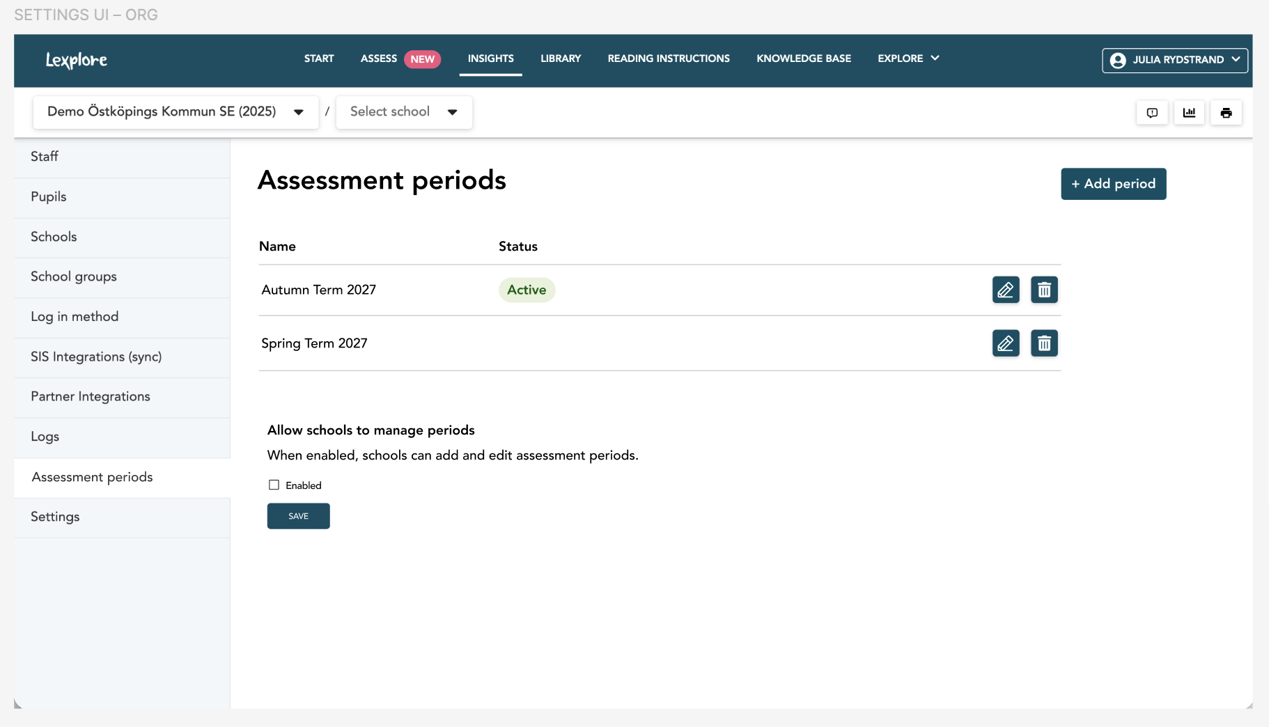
I mapped the admin interactions across two flow charts, which fed into a single admin view. That view covered the core period management actions: adding, editing, deleting, and setting the active period, as well as a permission setting that determined whether organisation admins wanted to allow individual schools to manage their own periods.
For teachers, I designed a separate read-only view showing existing periods and the currently active one, with the option to add and edit periods if enabled at organisation level.
Individual result page
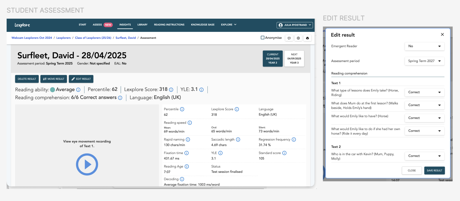
I also designed a state for the individual student result page, where it was possible to add a period to an assessment afterwards, edit which period it was assigned to, or remove the period entirely.
Handover and iteration
Once the design was ready, I presented it to the frontend and backend developers to walk through the flows and address any questions before development. After implementation in the dev environment, I tested it internally with the team. This surfaced some backend logic issues, such as a case where it wasn't possible to change a period on an existing assessment. Sorting was also added at this stage to the list of assessment periods in both the admin and teacher views, making the lists easier to navigate as the number of periods grows.
The outcome
The final design covered 13 screens, states, and dialogues across the full flow. From kickoff to a design ready for release, the project was completed in two weeks.
The design was implemented and tested in the dev environment and signed off for release. The head of product noted this would be significant news for the organisations that had been requesting it longest. As my internship ended before the release to customers, I handed it over in a state ready to ship.
Reflection
This project reinforced something that became clear during the first phase of work: trust isn't only built through good interaction design. It's built and broken in small moments of language throughout a product. A single sentence on a button can carry real risk if it's misread, and a single audit can quietly support a business goal it was never explicitly asked to solve. UX writing is as much about getting the words right as finding the risks and opportunities hiding inside them.