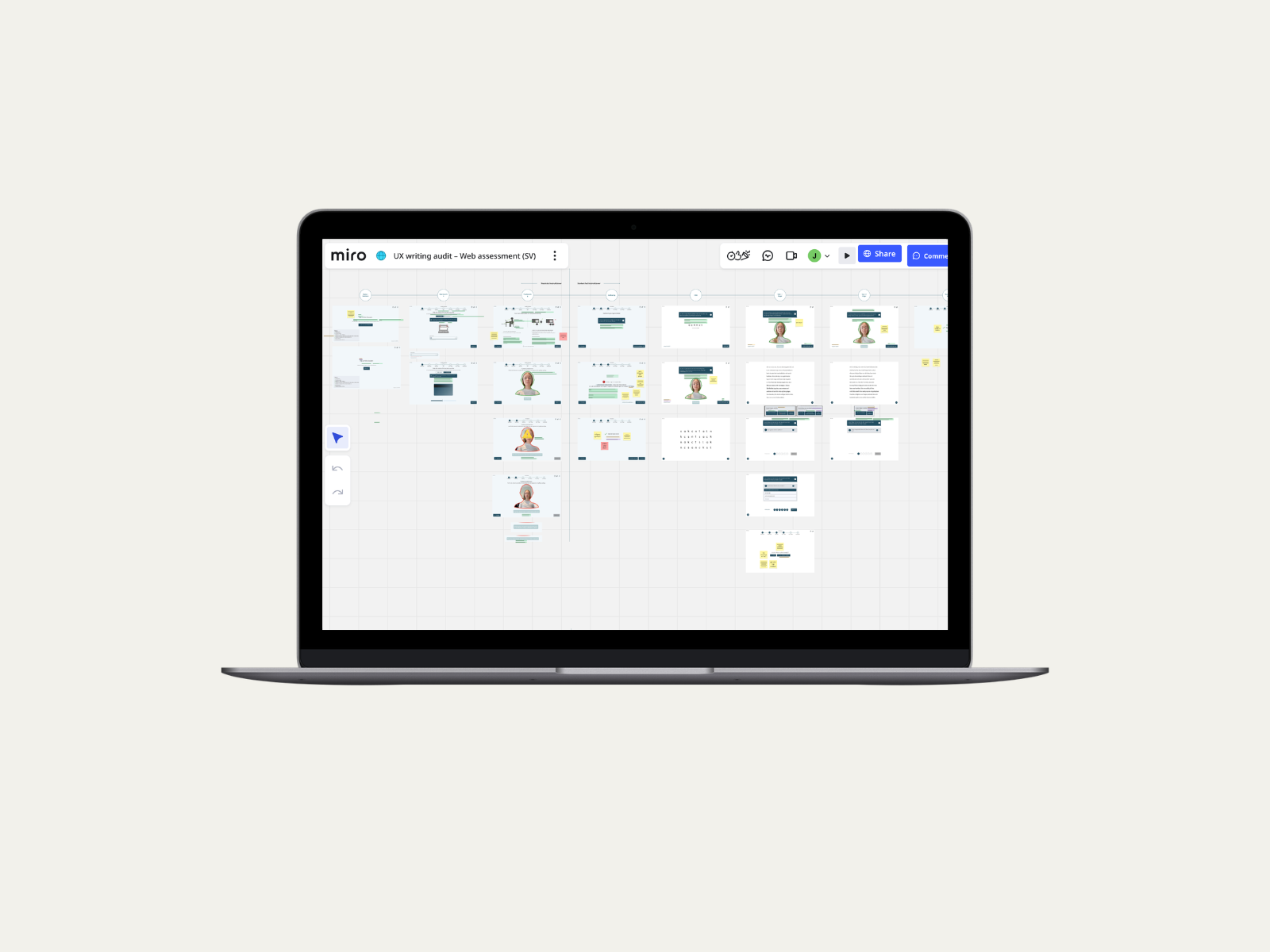
A UX writing audit for trust and clarity: Lexplore Web Assessment
A UX writing audit covering copy review, pattern identification, and terminology consistency across Lexplore's Web Assessment flow.
Overview
This project followed from my earlier work on the Web Assessment transition. Two things prompted me to propose it.
First, I knew spacebar navigation had caused confusion among teachers about whose turn it was to act, teacher or student. It hadn't been addressed as a design fix and was sitting in the product backlog.
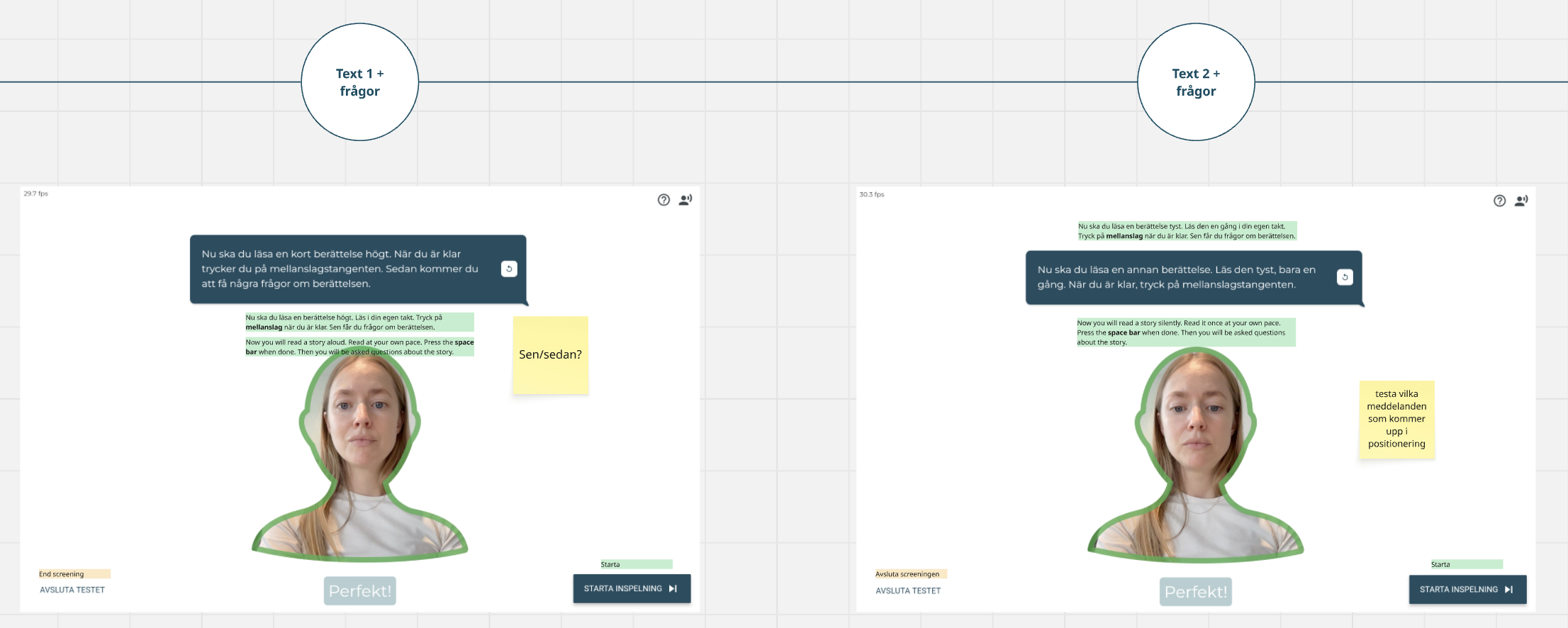
Second, before the full rollout, a parent at one of the early customer schools worried that Lexplore was recording and storing video of their child. The school considered not moving forward because of it. The complaint was about the webcam in general, but I identified the assessment flow's own language as a likely contributing factor: the button to begin an assessment was labelled "start recording," when in fact only eye-tracking data was captured. No video was recorded or stored. I treated this as a likely signal of a broader pattern, if one parent voiced the concern, others were likely thinking it.
Together, these two signals led me to propose and lead a full UX writing audit of the assessment flow ahead of launch.
Role
UX Writer
Team
1 UX Writer, 1 CS Manager, product owner
Project duration
1,5 weeks
The problem
Across the assessment flow I found three recurring issues. Language unintentionally suggested video recording when none was happening, instructions didn't clearly signal whose turn it was to act, and terminology was inconsistent throughout the flow, making the product feel less coherent than it actually was.
Together, they added friction and doubt at the moments the product needed to feel most reliable. The recording language risked actively damaging trust with parents.
The process
Defining the lens
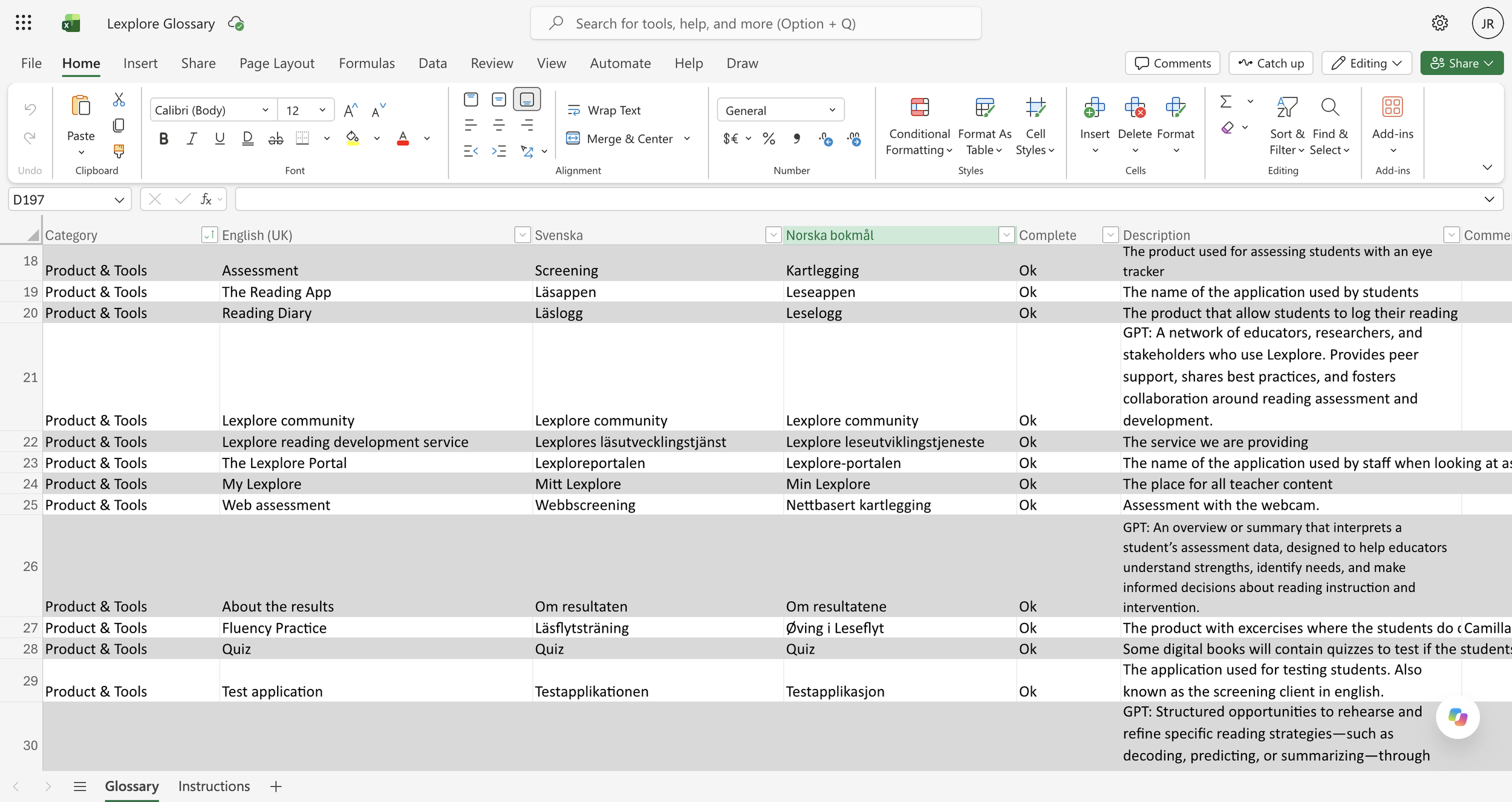
Before reviewing any copy, I established what I was checking for. Three criteria: whether language preserved or undermined trust, particularly around anything that could be misread as recording. Whether instructions clearly signalled who was meant to act at each point in the flow. And lastly, whether terminology was used consistently, checked against Lexplore's existing glossary of established product terms.
Systematic review
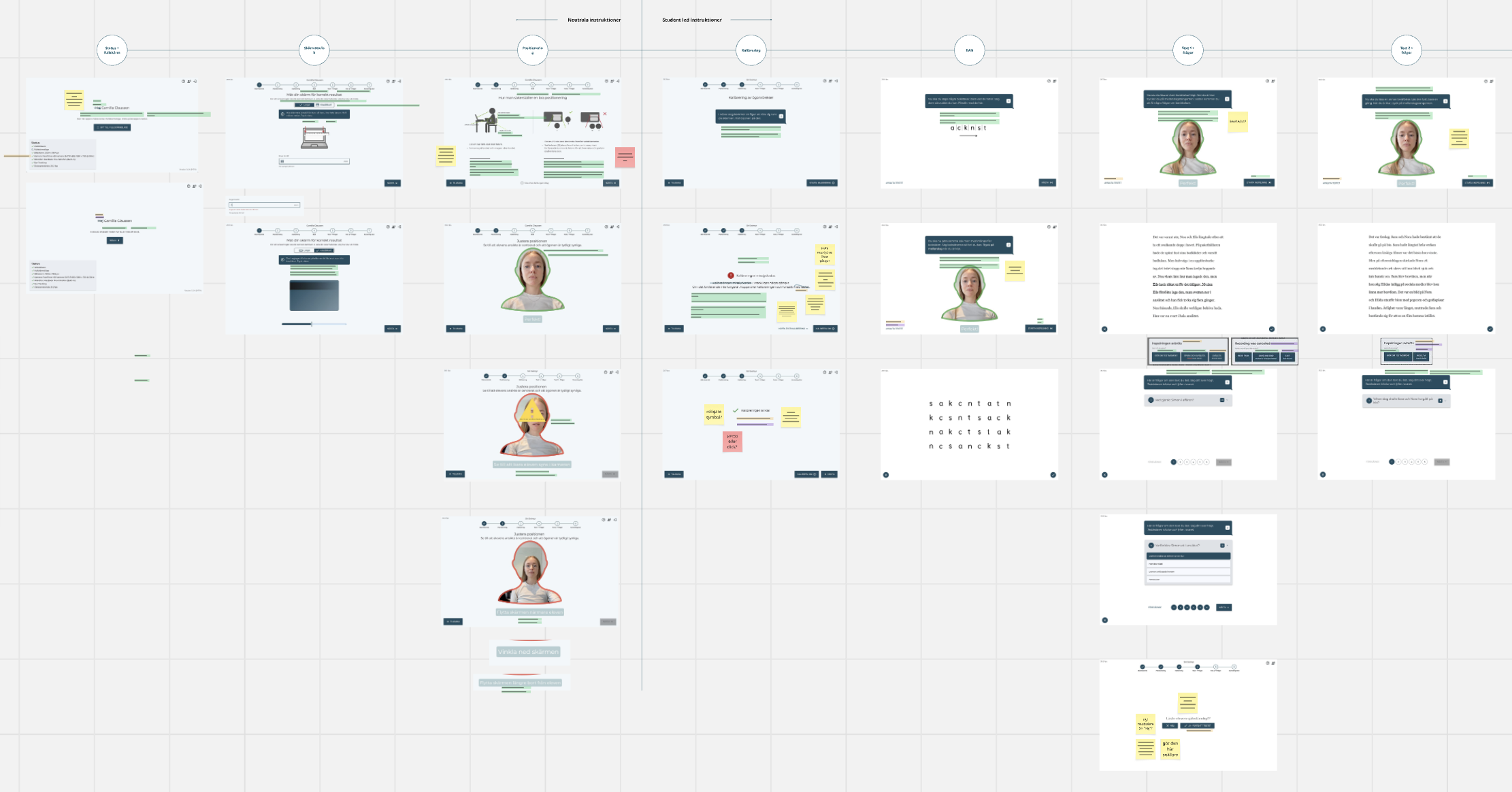
I went through the assessment flow screen by screen, in the order a teacher and student would experience it, documenting every instance where the copy fell short against one of the three criteria.
Identifying patterns
I grouped findings into patterns. The most urgent was the recording language. Several instructions, including the primary button to begin an assessment, used wording that implied video was being captured, when only eye-tracking data was collected. Given the parent complaint, I treated this as a priority fix with direct implications for trust, not just a wording cleanup.
The second was role clarity. I revised instructions throughout the flow to make explicit which parts were teacher-led and which were student-led, reducing moments of waiting, guessing, or one party stepping in for the other. This was the fix for the spacebar confusion I'd flagged at the outset of this project. It's worth noting this confusion may also stem from unfamiliarity with a new flow. Language clarity addresses the symptom, not necessarily the full cause.
The third was terminology consistency. I checked every term against Lexplore's existing glossary, correcting instances like inconsistent use of "test" where "assessment" was the established term.
An unplanned strategic outcome
While the audit wasn't designed around this, I made one additional decision with a longer view in mind. Lexplore had already decided to expand from a B2B-only model into B2C, opening the door to selling Web Assessment directly to parents, such as those homeschooling, not only to schools. I used the audit to neutralise language that assumed a school context, removing unnecessary references to "teacher" or "classroom" where the instruction didn't require them. I flagged this work to the head of product, who noted it would let Lexplore use the same product for both B2B and B2C without building a separate version. This wasn't the brief, but it positioned the language to support that expansion.
The outcome
The audit findings were well received internally. The head of product and customer success confirmed the new copy addressed the trust and recording concerns. The team chose to implement and launch the corrected copy ahead of usability testing. Given the urgency of the parent complaint and the inconsistencies in the product, the team and I agreed that speed mattered more. I documented usability testing as a recommended next step post-launch.
I used Lexplore's localisation tooling to translate the finalised Swedish and English copy into three additional languages. I recommended a manual quality check of each translated language before going live, to confirm the translations preserved the same trust and clarity decisions made in the source copy.
At the time of writing, this audit is pending usability testing. Stakeholder feedback was positive, but quantitative validation is still outstanding.
Reflection
This project reinforced something that became clear during the first phase of work: trust isn't only built through good interaction design. It's built and broken in small moments of language throughout a product. A single sentence on a button can carry real risk if it's misread, and a single audit can quietly support a business goal it was never explicitly asked to solve. UX writing is as much about getting the words right as finding the risks and opportunities hiding inside them.