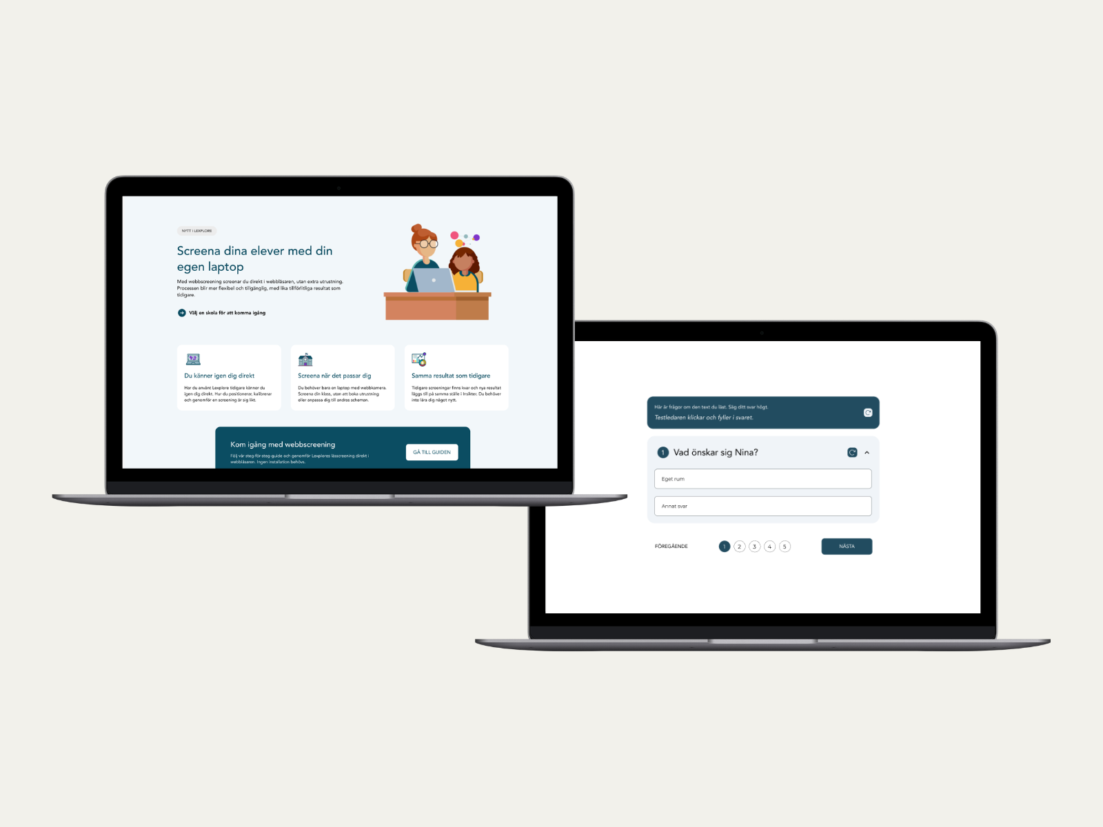
Designing trust in transition: Lexplore Web Assessment
A UX study in transition design, covering research, interaction design, prototype testing, and onboarding materials for Lexplore's shift from hardware to web-based reading assessment.
Overview
Lexplore is an EdTech company that uses eye-tracking and AI to support reading development in primary school. Teachers use it to assess students and evaluate their reading ability.
When Lexplore replaced its hardware-based reading assessment with a web-based version, teachers in their customer base had to change how they worked. I led the UX work to make that transition feel safe: researching how teachers experienced the change, designing fixes, and building onboarding and support materials that gave Lexplore the confidence to launch.
Role
UX Designer
Team
1 UX Designer, 1 developer, product owner
Project duration
8 weeks
The problem
Lexplore was transitioning all teachers from a familiar hardware-based assessment to a new web-based platform. The existing support material was scattered and incomplete. A poor first experience carried the risk of slow adoption and trust that would be hard to rebuild.
The challenge was understanding where confusion arose, what held teachers back, and what habits from the old setup they were bringing to something new. Then translating those insights into UX improvements, onboarding, and communication that made the transition feel safe and manageable.
The process
Discover
Journey mapping
I facilitated a workshop with the cross-functional team, product, support, and sales, to surface the assumptions we were carrying into the launch. We built a hypothesis-based journey map covering five phases of the teacher's experience: from first hearing about the change to post-assessment reflection and support. The goal was to identify moments where a teacher would either build confidence or lose it.
Teachers were familiar with Lexplore, but Web Assessment was new to them, and they were also navigating a workflow change. Those were two distinct problems and would need different responses.
The team aligned on one clear priority: the live product experience. If that first moment with a student fails or feels unclear, teacher trust drops significantly, and no amount of preparation compensates for that.

Research
I met teachers in real school environments, some in person and some remote via Teams. Each teacher assessed a student during the session to simulate a real assessment. I used observation and think-aloud methods, followed by semi-structured interviews. The interviews used open questions to deepen understanding of teachers' experiences and validate the assumptions from the workshop.
Define
Synthesis
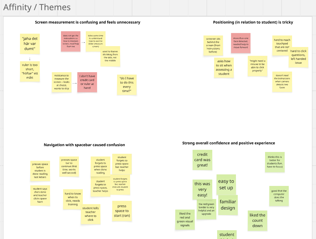
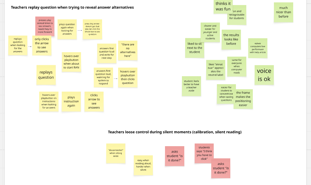
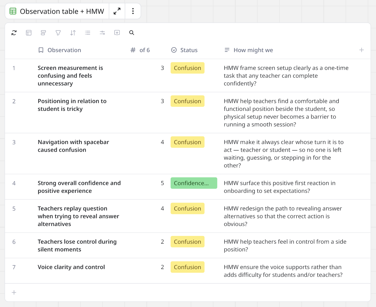
I built an affinity map in Miro to cluster raw observations, then documented findings in an observation table with tags, frequency counts, and How Might We questions. I kept the synthesis lean and adapted the methods to the project rather than following them rigidly. One key learning on this project was knowing when a framework serves you and when it doesn't.
Prioritisation, two fixes and four recommendations
Six friction points were identified in the product and I prioritised two for design work. I made that call based on frequency, severity, and where each issue sat in the flow.
Develop
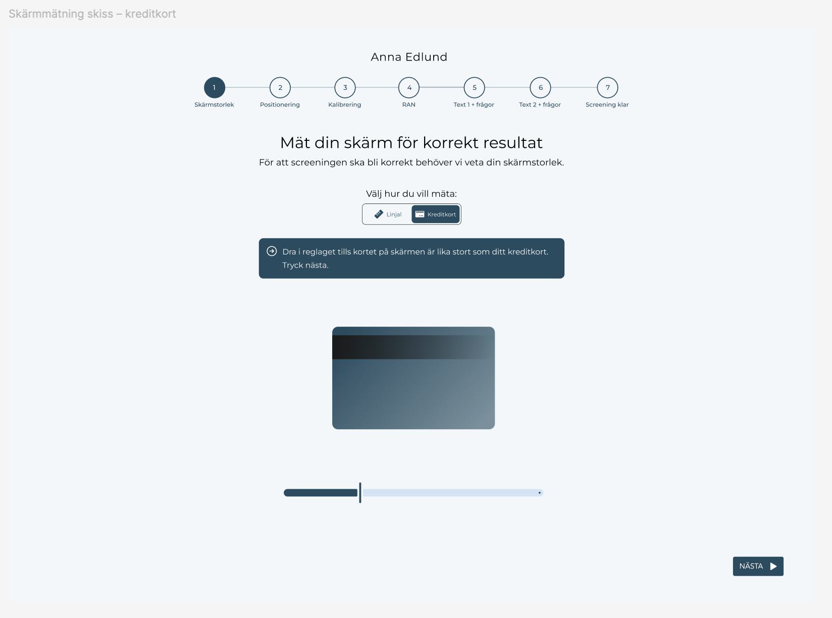
Design and prototyping
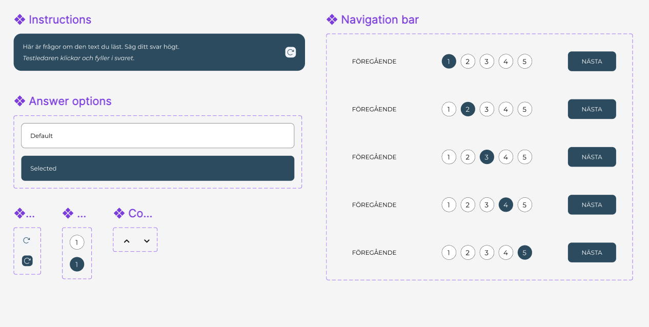
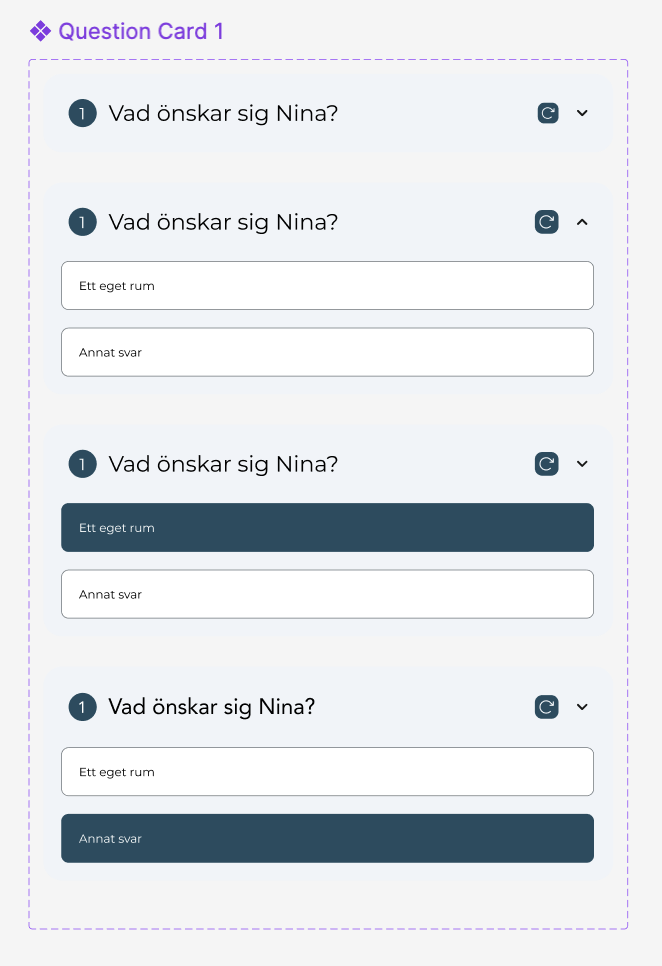
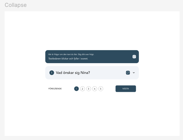
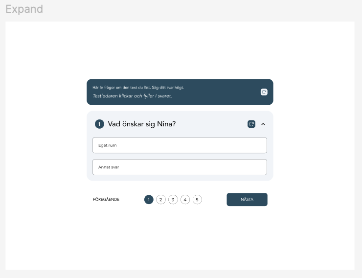
I designed revised interactions for both the answer reveal flow and the screen measurement step, then built a clickable prototype in Figma for the answer reveal. I ran the prototype past the team internally and iterated on the design before testing with teachers. The screen measurement was also tested within the team.
Validation
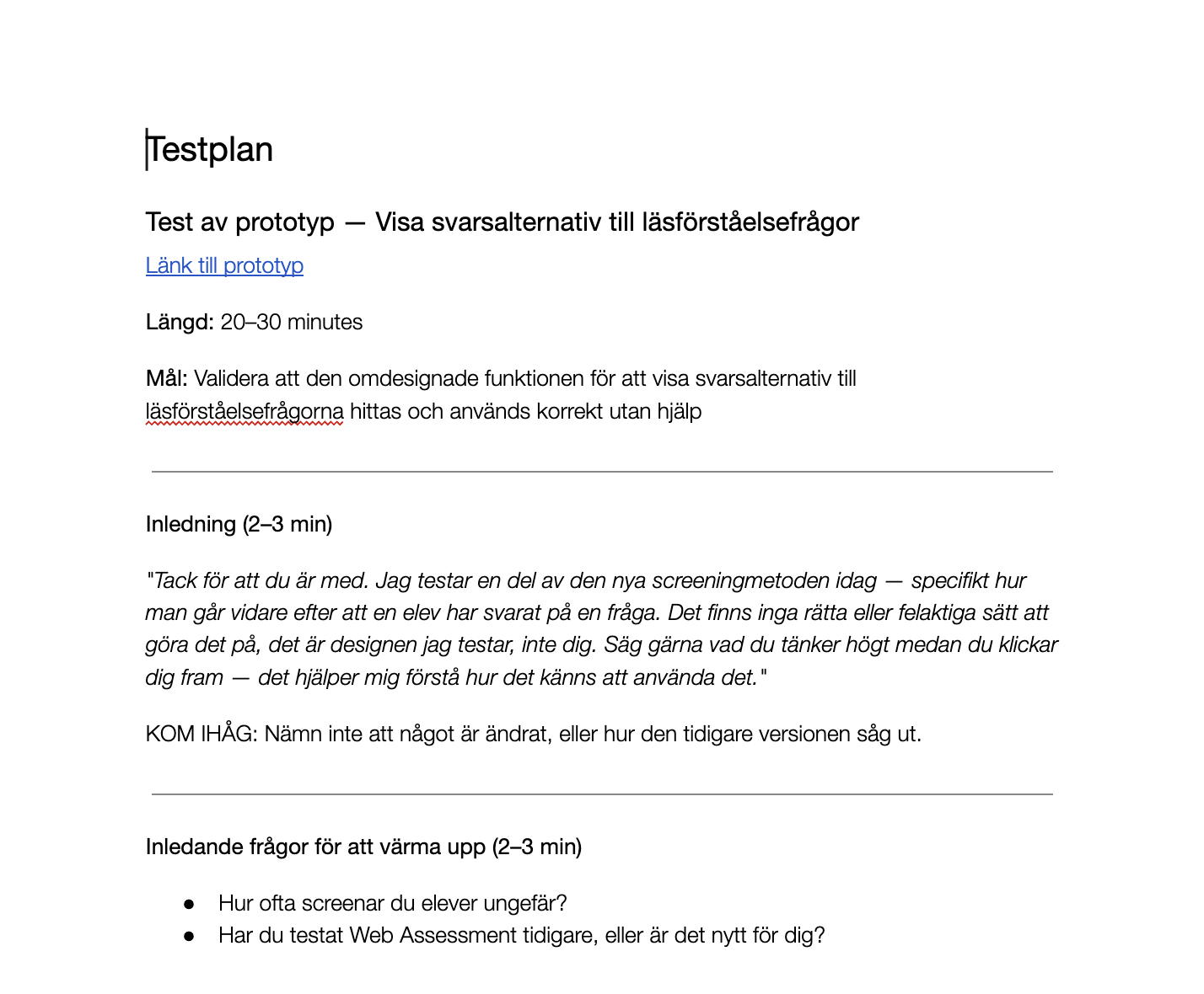
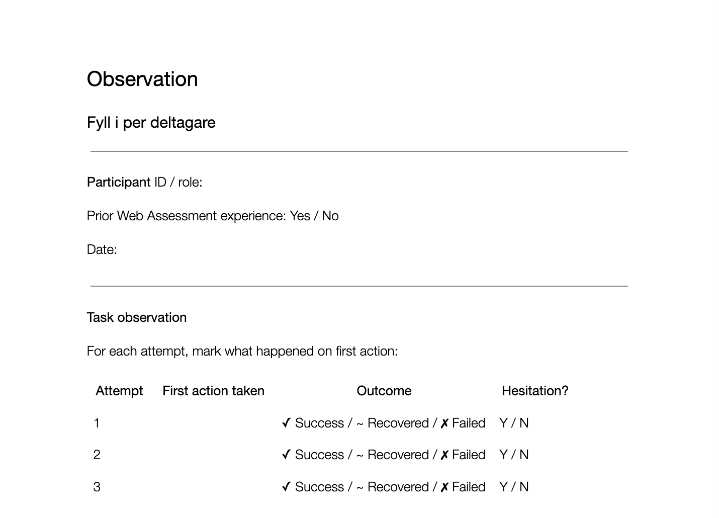
I tested the answer reveal prototype with five teachers. In the initial research, four of six had pressed the wrong control. After the redesign, four of five found the correct interaction immediately with no guidance. The fifth succeeded on the second attempt, also without help.
The sessions also surfaced positive signals beyond the fix itself. Teachers appreciated seeing one question at a time and found the progress indicator reassuring. Both were intentional design choices grounded in common UX principles. The validation confirmed they were landing well, even though they had not been raised as friction points in the research.
The screen measurement was implemented but not validated within the project timeline. The team chose to move ahead without waiting for validation. I flagged the gap and recommended it as the first usability test to run after launch.
Deliver
Handover
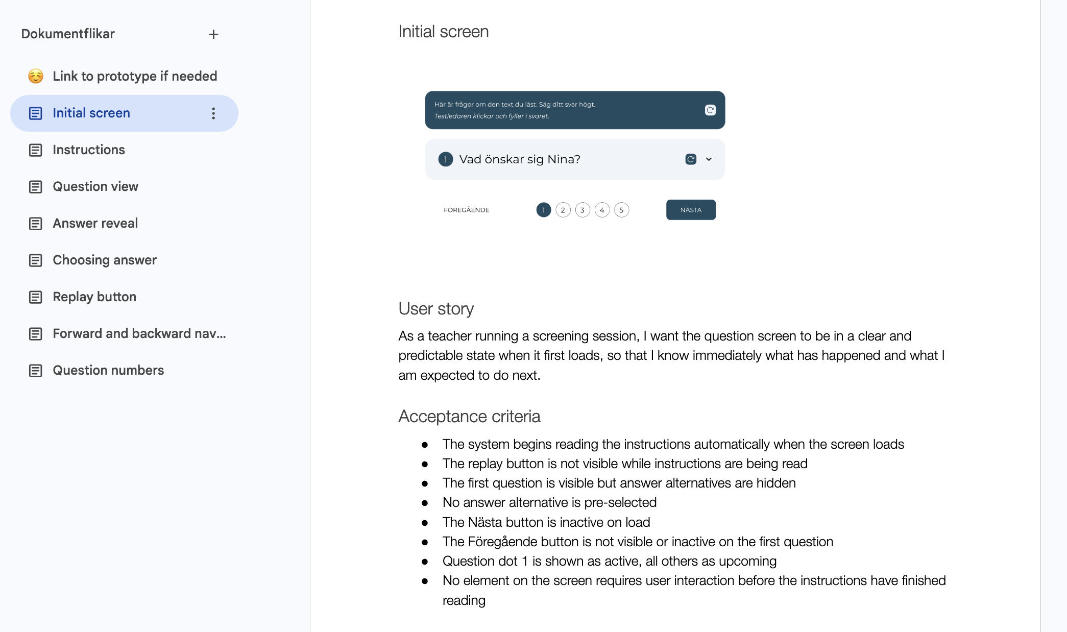
I wrote user stories with acceptance criteria for the developer, covering both the answer reveal flow and the screen measurement step. Once implemented, I worked with the developer through a few smaller iterations to align the designs with the existing design system.
Support materials: closing the gap between product and transition
With the product experience addressed, I turned to teacher readiness. Teachers needed the right information, at the right moment, in the right tone to feel confident enough to make the switch. I developed two pieces of support material.
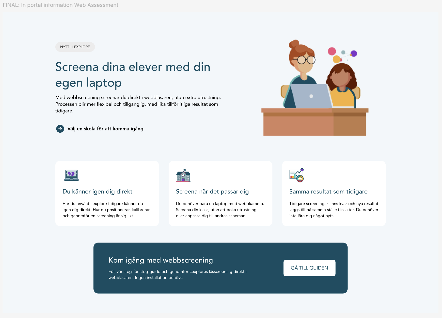
The first was a landing page within the Lexplore portal, introducing Web Assessment at the point where teachers would first encounter it. The page led with the scheduling freedom teachers valued most, confirmed that results remain the same, and gave a clear path to getting started.
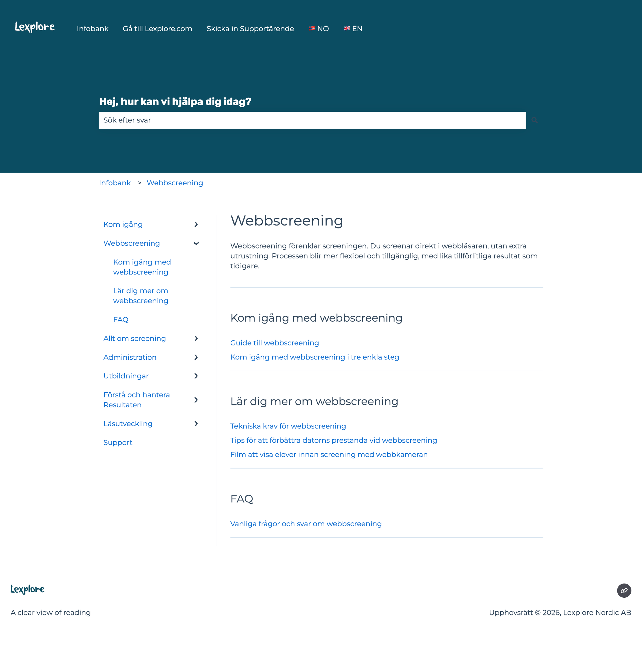
The second was a landing page in Lexplore's knowledge base, structured around two needs: getting started and learning more. The page also included an FAQ built directly from questions that surfaced during usability testing.
The outcome
The redesigned answer reveal flow delivered a clear before and after. In the research phase, four of six teachers pressed the wrong control. After the redesign, four of five found the correct interaction immediately with no guidance.
Before the full rollout, Lexplore opened Web Assessment to selected customers. The support team adopted the knowledge base page as their default resource for setup guidance and transition queries from the moment it went live.
Together, the research findings, validated design, and support materials gave Lexplore the confidence to release Web Assessment to all users. The product launched as planned.
Reflection
Two things stayed with me from this project.
First, the step that turned out to be the most common point of failure was one I hadn't considered a risk before testing. It's a good reminder of why testing with real users matters, and why your own assumptions are never a reliable starting point.
The second is that a better interface is rarely the whole answer. The teachers who struggled weren't struggling because the product was bad. They were struggling because the situation was new, and no amount of good design fully compensates for a transition that people don't feel prepared for.
Improving the product and equipping teachers to feel ready are not the same problem, and they need different solutions. That gap between product quality and user readiness is just as important as continuing to improve the product itself.